01
CONTEXT
Every game had its own header. That was the problem.
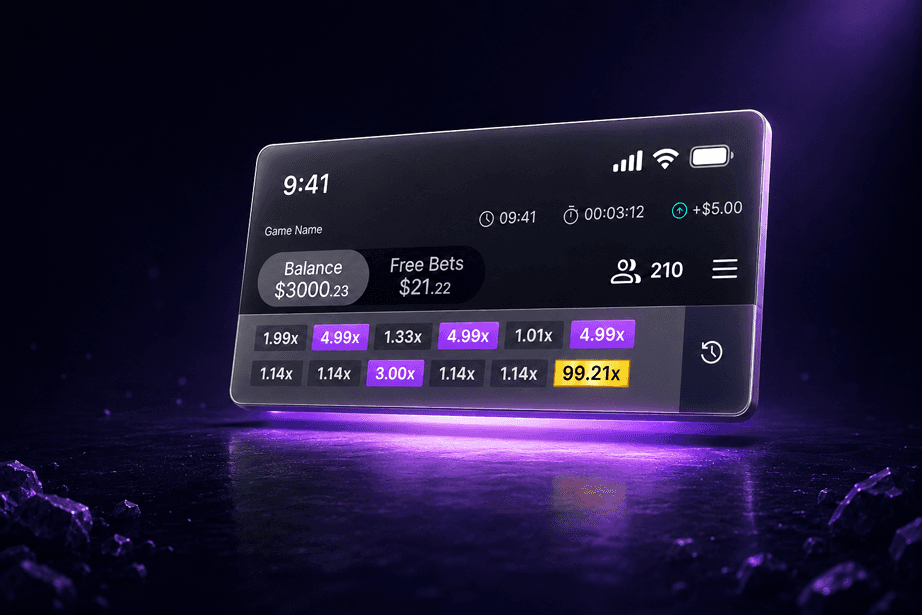
Incentive Games develops a suite of crash-style games — including Red Light Green Light, Glass Bridge, Payout Pilot, Mega Flight, and Velocity. Each game shares a common need: a persistent header that communicates game state, balance, credits, and community data to the player.
As the team grew and more games shipped, headers had evolved organically. Every new game meant a designer making slightly different decisions about layout, icons, and information hierarchy — a fragmented experience that slowed development and confused players moving between titles.
9+
Active games affected
2x
Design effort per new game
0
Shared header components
02
PROBLEM
It wasn't chaos. It was just... quietly broken.
Here's the thing about inconsistency in design; it rarely screams at you. It just quietly erodes trust. Players don't think "hmm, that icon is non-standard." They just feel slightly less confident. Slightly more friction. And they can't tell you why.
When I audited the existing headers, three things jumped out immediately.
01
We were rebuilding the same thing over and over
Every new game, a designer would start from scratch. Same elements, same constraints, different decisions. That's not creative freedom — that's just wasted time. And it meant features could go missing or get implemented differently depending on who was building that week
02
The wrong icon was being used as the main menu
Some games had swapped the hamburger menu for the three-dot "More" icon. That three-dot icon? It means overflow actions — stuff like Report, Block, View Profile. It's not a menu. Players were hitting it expecting navigation and getting confused. Small detail, real problem.
03
The same franchise was contradicting itself
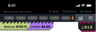
Both Squid Game variants — Red Light Green Light and Glass Bridge — used colour to distinguish balance from credits. But they'd done it in opposite directions. Pink meant balance in one, credits in the other. You can't make that up. It happened because no-one was checking.
Current game headers lack consistencty
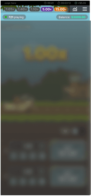
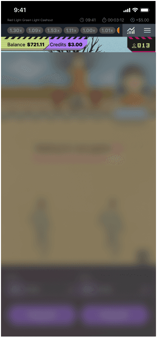
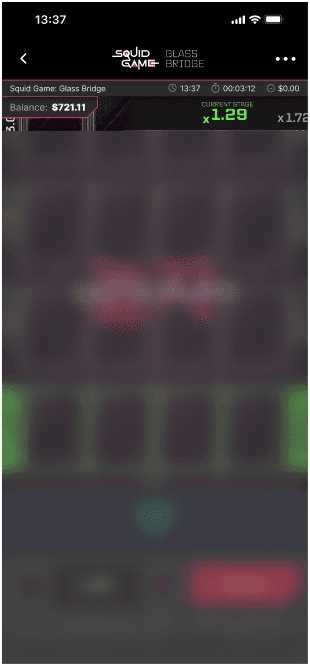
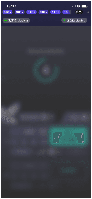
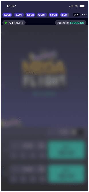
The five existing headers side by side. Same game studio, completely different decisions across each one.
Squid Game - Red Light Green Light Cashout
Squid Game -
Glass Bridge
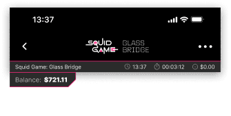
These 2 headers are both for Squid Game so they should be the same. The only difference should be that Glass Bridge does not show the player count.
Some things weren't up for debate.
Before jumping into solutions, it was worth getting clear on what couldn't move. Designing within constraints isn't a limitation, honestly, it makes the decisions easier because half the scope is already defined for you.
01
Compliance wasn't optional
UK gambling regulations require specific information to be visible at all times — balance, credits, session time, game name. Whatever we built had to keep all of that. No workarounds, no exceptions.
02
Some games are social, some aren't
Crash games where hundreds of players are betting at the same time have a community element — showing player counts creates social proof and engagement. Single-player games don't need that. One header had to handle both without duplicating code.
03
Mobile first, always
Everyone's playing on their phone (okay...85%). The header has maybe 60px to work with vertically. Every element in that strip earns its place or it doesn't get one.
04
Operators need to theme it
Different licensing partners need their own colour schemes. The structure had to support that without every operator needing a custom build. Skinnable from day one.
04
RESEARCH & INSIGHTS
I didn't just go with my gut. We tested it.
You know that moment when you're pretty sure you're right about something, but you know the conversation will go better if you have data? That's exactly why we ran usability research through UserLytics before standardising the icon set.
We weren't trying to discover something nobody knew. We were trying to make the decision undeniable. And it worked.
Hamburger menu — adopted
Universally recognised as the primary navigation trigger. Everyone knows it. It's not exciting design, but that's the point. It just works, and players find the menu without having to think about it.
Three-dot icon — retired
The research confirmed what felt off. The three-dot "More" icon belongs next to individual items — a player in a leaderboard, a comment in a feed. Not as the door to the whole app. Players weren't registering it as the menu, and that's a usability failure regardless of how it looks.
History icon — standardised
The clock icon for history was instantly recognised across all participants. This sounds obvious, but it wasn't obvious to everyone on the team. Earlier games — especially those built for African markets — had used a bar chart icon that players there called "The Graph." Fine for that audience. Not universal. The clock is universal.
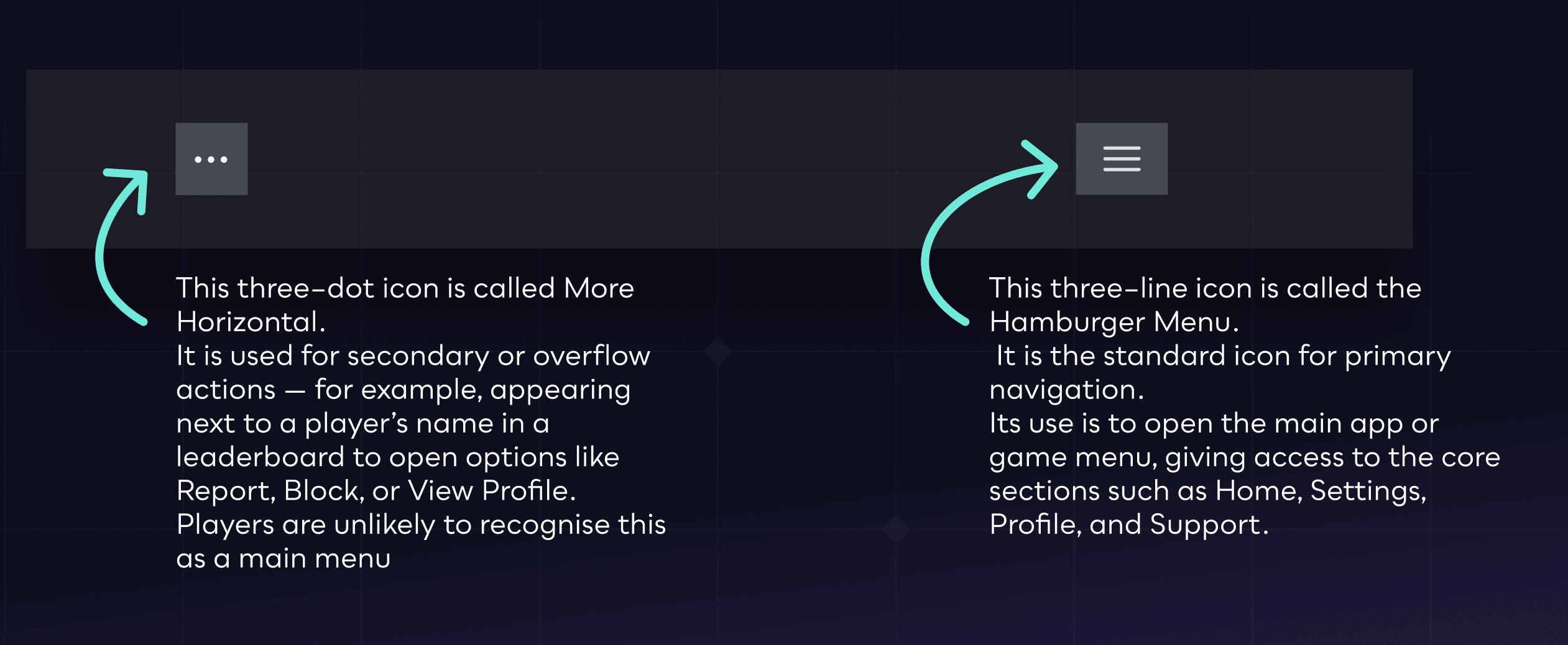
The icon audit. On the left, what some games were using. On the right, what we standardised to. The difference in player comprehension is significant.
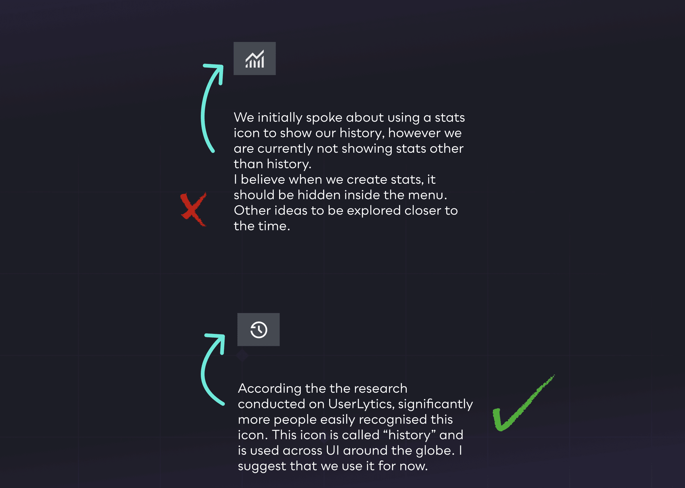
History icon decision. The bar chart felt logical but tested poorly outside specific markets. The clock icon is what players everywhere already expect.
05
Approach & Solution
One system. Two modes. Every game covered.
The solution wasn't complicated once the problem was clear. We needed a single header component that could flex between two configurations — not two separate things that happened to look similar, but genuinely one thing with two modes.
Think of it like a thermostat. Same device, same interface, just doing different things depending on what the environment needs.
General layout
Every new game, a designer would start from scratch. Same elements, same constraints, different decisions. That's not creative freedom — that's just wasted time. And it meant features could go missing or get implemented differently depending on who was building that week
Balance
Credits
Free Bets
Menu
Compliance
Community layout
Every new game, a designer would start from scratch. Same elements, same constraints, different decisions. That's not creative freedom — that's just wasted time. And it meant features could go missing or get implemented differently depending on who was building that week
Balance
Free Bets
Menu
Compliance
History rows
Player count
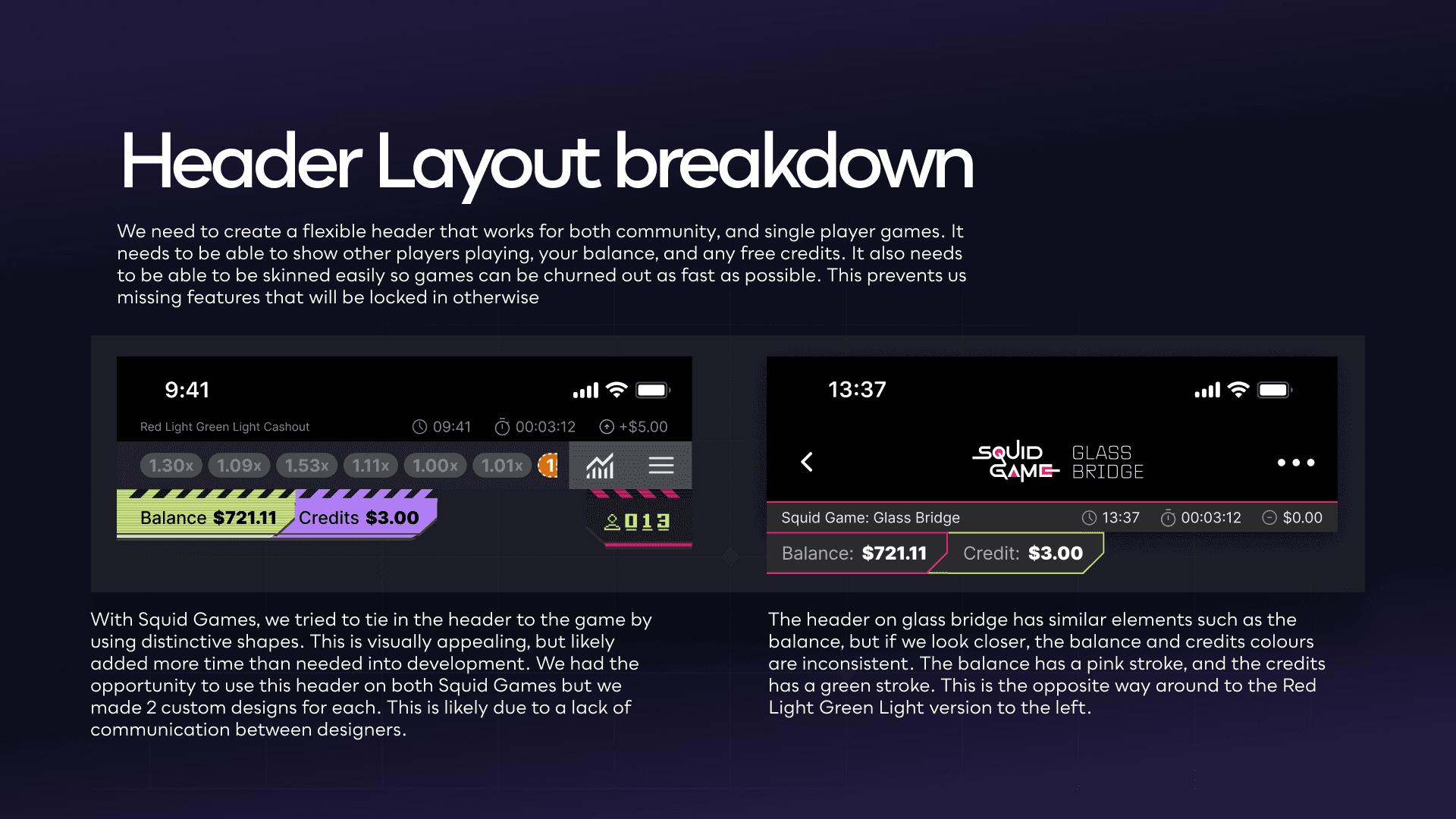
The layout breakdown that kicked everything off. Two Squid Game headers, side by side, doing contradictory things. The colours on the balance and credits are literally swapped (slide taken from a presentation I gave to the company).
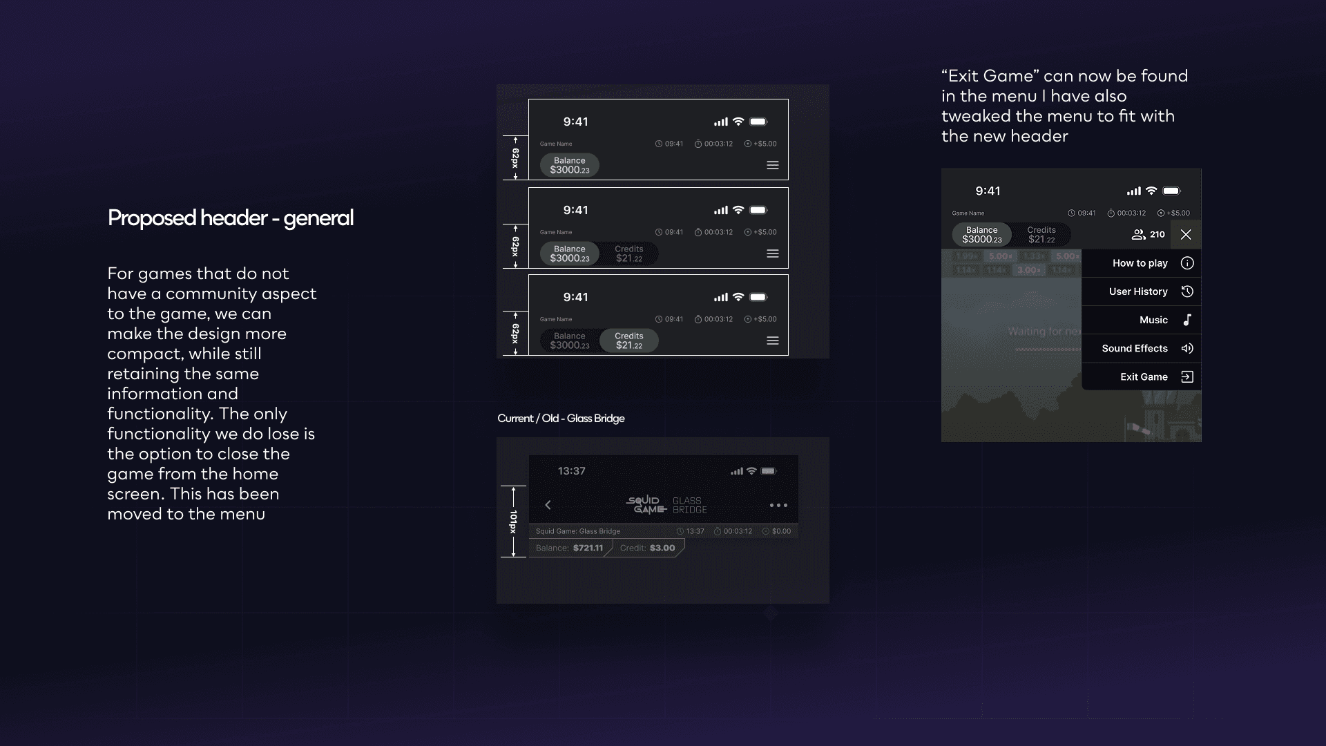
The proposed general layout. Three states, 62px height, Exit Game moved into the menu. Cleaner, faster to build, and compliance-safe.
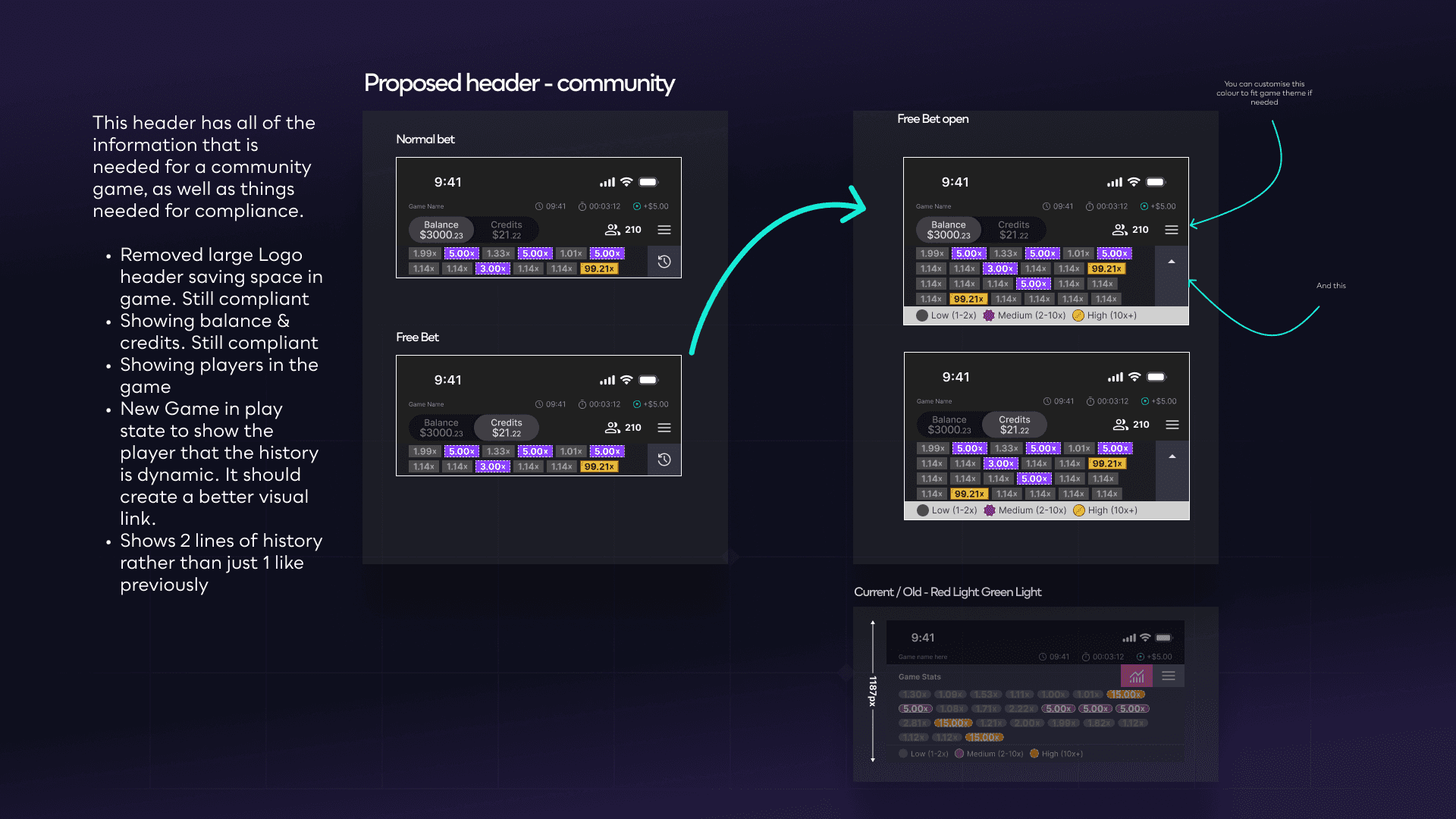
The community layout with all states shown — Normal Bet, Free Bet, and the expanded Free Bet view with the Low / Medium / High multiplier colour legend. Two rows of history instead of one.
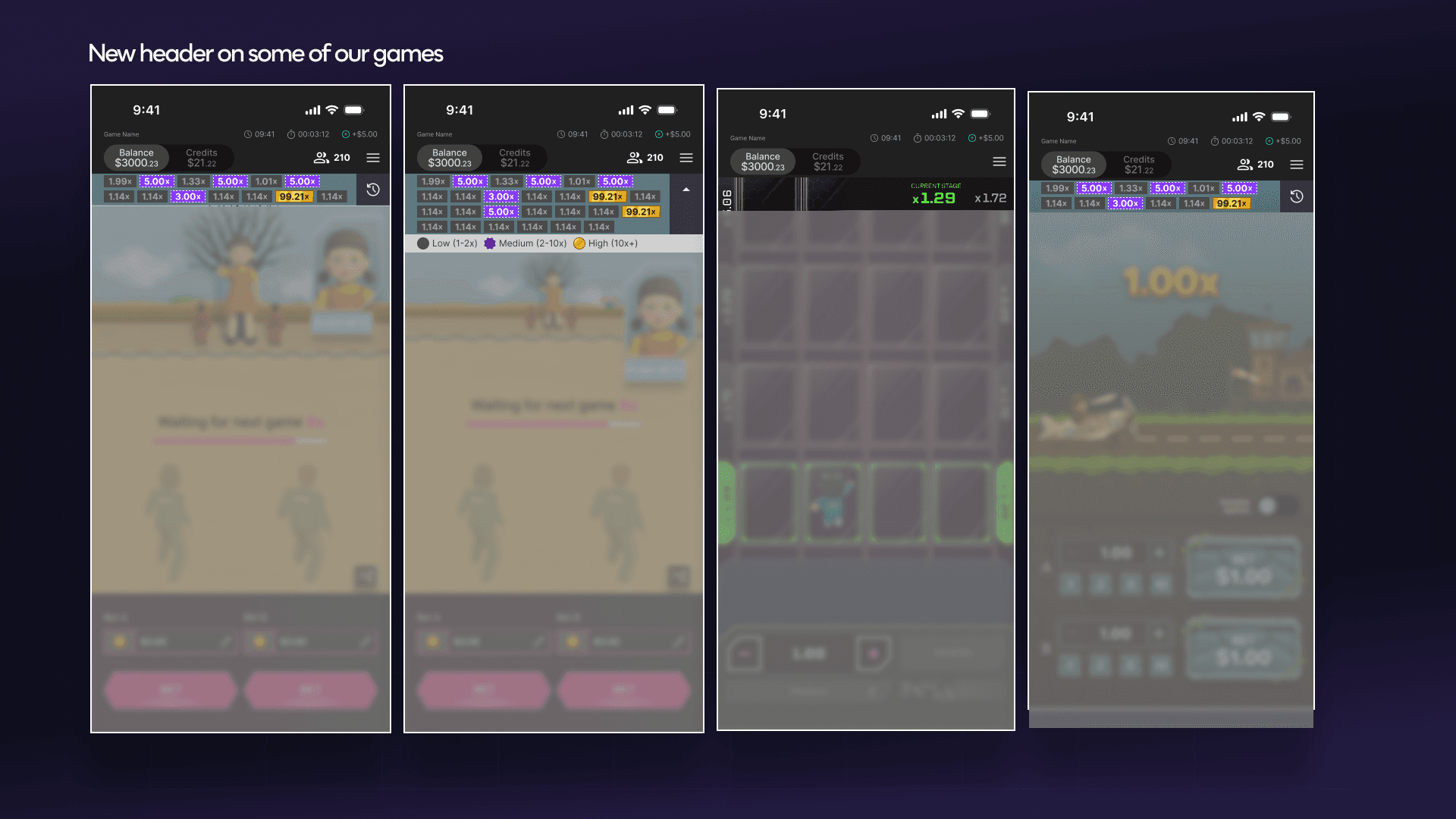
The new header on all four games. Same component, different skins. This is what it looks like when the system actually works.
I wasn't just solving today's problem.
Here's what I mean: you can fix an inconsistency, or you can fix the conditions that created it. The first one helps right now. The second one keeps helping every time a new game gets built.
So while the immediate goal was getting the existing headers aligned, I was thinking about the designer who'd be starting a new game in six months. What would make their life easier? What would stop this from drifting again?
01
The colour system is theming-ready
The Free Bet strip colour is overridable per operator. This sounds like a small thing but it means a new licensing deal doesn't require rebuilding the header — just swap the token. The presentation even called this out explicitly: "You can customise this colour to fit game theme if needed."
02
Compliance lives in its own layer
The regulatory row — game name, local time, session time, net position — sits beneath the interactive header as a standalone module. If the rules change (and they do change), you update one thing. Not five.
03
Exit Game moved into the menu
Previously some games had an X in the header to close the game. That X was eating space and causing accidental exits when players were just trying to access settings. Moving it to the menu standardised the pattern across all games and stopped that problem cold.
04
Tested across all seven games before handoff
Rather than presenting the component in isolation and hoping it'd work, I applied it to every existing game in Figma first. Red Light Green Light, Glass Bridge, Payout Pilot, Velocity, Kicker, MegaFlight, MegaFlight Boost, and Zeus Surge. All of them. If something broke, I wanted to find it in the file, not in development.
06
OUTCOMES
Fewer decisions to make. Faster games to ship.
The impact here isn't a dramatic before-and-after. It's more like a quiet background improvement — the kind you only notice when you realise you haven't had to think about something that used to take time.
1
Shared header component across everything
2x
Layout modes covering every game type
0
Icon inconsistencies after rollout
01
New games launch faster
The header is no longer a design task on each new game — it's just a component you drop in. That's hours of design time and dev time back, every launch, indefinitely.
02
Compliance risk is lower
When the required elements are baked into the component, they can't accidentally go missing. The header either meets compliance by default or it needs to be rebuilt from scratch — and nobody's rebuilding it from scratch.
03
Players have a consistent experience
Someone who plays Red Light Green Light and then loads up Payout Pilot finds the same header, same icons, same layout. They don't have to re-orient. It just feels familiar. That's the kind of detail players don't notice — and that's exactly right.
04
The team has a shared language
Before this, "the header" meant something slightly different to everyone. Now there's a documented component, agreed states, named icons. Less back-and-forth in Slack. Fewer revision cycles. That adds up.
07
REFLECTION
What I'd tell myself at the start of this project.
The impact here isn't a dramatic before-and-after. It's more like a quiet background improvement — the kind you only notice when you realise you haven't had to think about something that used to take time.
01
The real problem was upstream
My first instinct was to fix the inconsistencies. But the inconsistencies were symptoms — the root cause was that there was nothing stopping them from happening. Once I reframed it as a systems problem, the solution became obvious. Always look for the conditions, not just the outcomes.
02
Data makes the obvious undeniable
When the required elements are baked into the component, they can't accidentally go missing. The header either meets compliance by default or it needs to be rebuilt from scratch — and nobody's rebuilding it from scratch.
03
Players have a consistent experience
Someone who plays Red Light Green Light and then loads up Payout Pilot finds the same header, same icons, same layout. They don't have to re-orient. It just feels familiar. That's the kind of detail players don't notice — and that's exactly right.
04
What I'd do differently
I'd quantify the cost of inaction before the first meeting. Senior stakeholders pushed back on the time investment, but nobody had put a number on what it would cost to retrofit five live games without a shared system. That's weeks of design and dev time, across every future release, compounding. I had the right answer. I just needed to walk in with the maths done.
08
MY CONTRIBUTION
What I actually did on this one.
I want to be specific here because "led the design" doesn't tell you much. Here's what I owned:
01
Ran the full header audit across five live games — documented every inconsistency, identified the root causes, made the case for treating it as a systems problem.
02
Commissioned and interpreted the UserLytics research on icon recognition. Wrote the brief, analysed the findings, translated them into specific design decisions.
03
Defined the two-layout system and specced every component state — balance-only, balance and credits, Free Bet open, community with player count, all of it.
04
Built and presented the deck to the wider team including dev stakeholders. Got alignment before a single line of code was written.
04
Applied the new header to all four existing games in Figma to validate compatibility — found and fixed issues before handoff.
04
Worked with the dev team to define theming requirements so operator-specific colour customisation was built in from the start, not bolted on later.