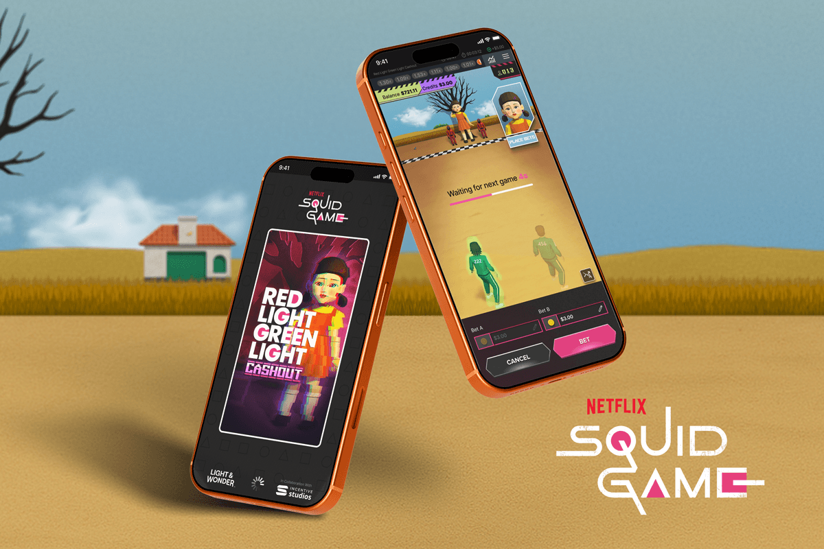

Designing a real-time crash game based on Squid Game’s Red Light Green Light, built around shared gameplay, player behaviour, and global audiences.
Adapting Netflix’s Red Light Green Light into a real-time crash game format while balancing global player expectations, regulatory constraints, and brand integrity.
Outcome
A globally released community crash game that introduced several firsts to the portfolio:
• First title to integrate sound into the crash experience
• First to introduce history pills as a strategic UI pattern
• First to implement a side by side dual betting layout
I led the design direction across gameplay, systems, and interaction patterns, helping shift the product from a traditional crash model toward a more immersive, entertainment-led experience.
The Design Problem
Traditional crash games such as Aviator use a simple left to right multiplier graph.
Red Light Green Light is spatial, character driven, and cinematic.
The challenge was not just visual. It was structural.
Crash games rely on clarity and predictability.
Squid Game is cinematic, spatial, and character-driven.
Combining the two without losing usability was the core design problem.
How do you:
• Preserve the clarity of a crash multiplier
• Keep the doll visible at all times
• Maintain tension
• Avoid gore due to regulation
• Serve very different global player behaviours

Different markets expected very different crash experiences
Research revealed a clear divide in player behaviour.
In African markets, crash games like Aviator dominate. Players are accustomed to lightweight visuals, graph based gameplay, and rapid decision making.
In contrast, US based research showed a preference for more immersive experiences, with stronger visual design, character presence, and sound playing a key role.
This created a clear product decision point.
Do we follow familiarity, or design for a different expectation?
Players perceive crash games as skill based
Players across both African and Western markets believe they can “read” the game using history.
In Africa, players often refer to the history as “the graph” and use it to decide when to enter.
This meant the history display was not decorative.
It was psychologically central.

Africa preferred traditional crash formats
Players were familiar with Aviator style games.
They valued clarity and graph familiarity.
Western markets wanted more entertainment
UK and US players responded strongly to theme, sound, animation, and spectacle.
The final product needed to respect both mental models.
The history pills became a decision tool, not decoration
Crash players do not treat history as passive UI. They use it to read patterns, judge momentum, and decide when to enter.
To design this system, I audited colour behaviour across established games and crash interfaces, including Fortnite, Call of Duty, Destiny, World of Warcraft, Aviator, and other titles.
A clear pattern emerged:
Grey or white for low
Purple for medium
Gold for high
I moved the product toward a grey, purple, and gold system to improve scannability, accessibility, and long term consistency across the portfolio.

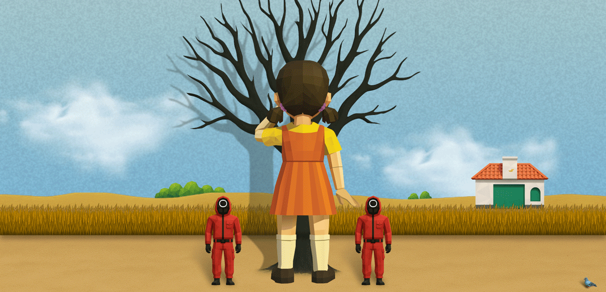
Reframing crash gameplay through cinematic perspective
Traditional crash games rely on a simple visual model. A single object moves across the screen until failure.
This experience required a different approach.
Players are positioned behind characters, running toward the doll, mirroring the Red Light, Green Light scene.
This introduced a challenge:
The doll and guards needed to remain visible at all times
The game duration is unpredictable
Moving toward a fixed object would break scale and composition
To solve this, I inverted the environment.
The doll and guards remain fixed
The floor moves beneath the player
Forward motion is implied rather than literal
This allowed the game to feel unmistakably Squid Game without losing the clarity crash players rely on.
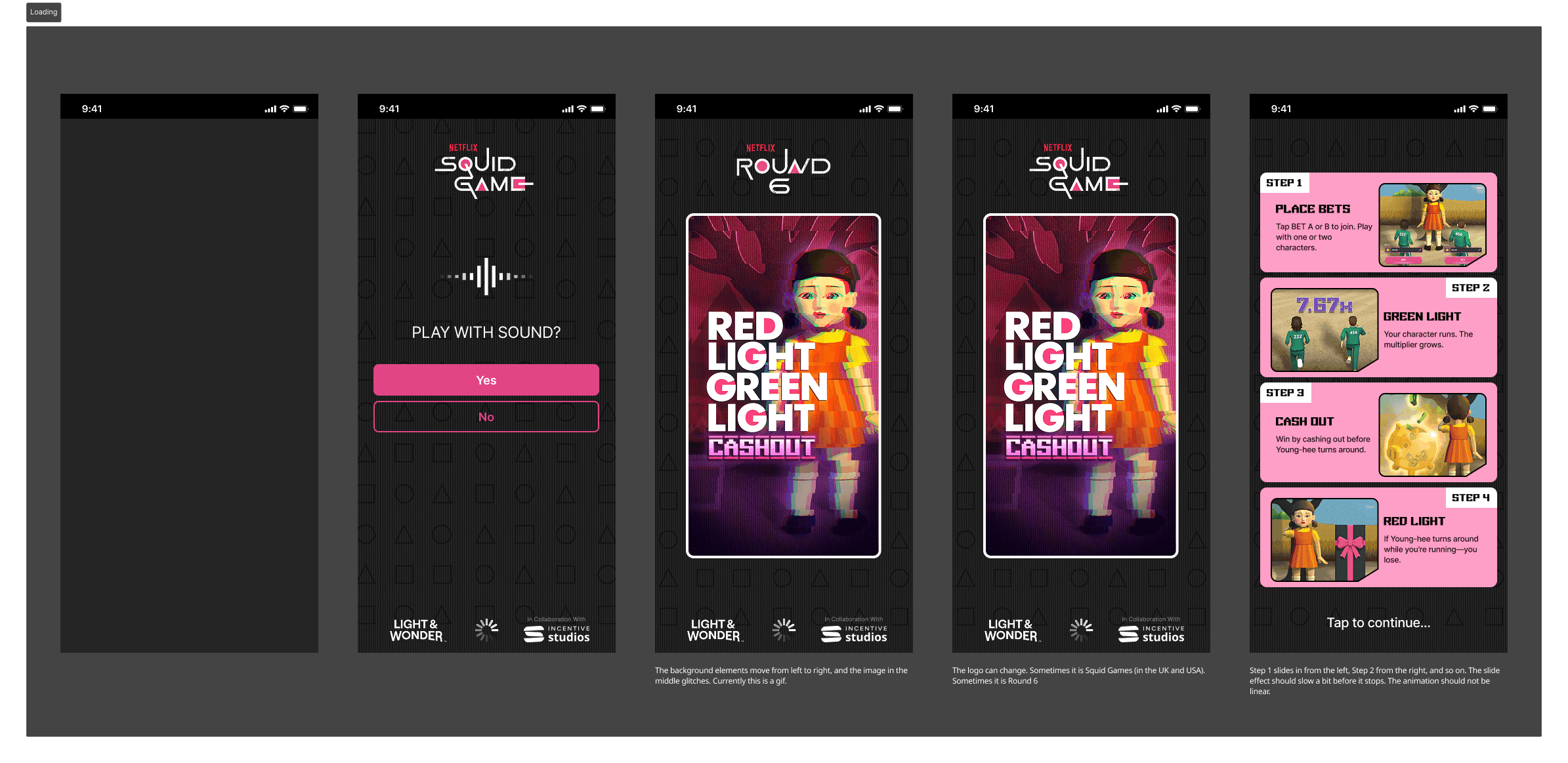
Designing a shared experience players immediately understand
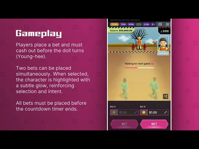
This is a community crash game where all players participate in the same live round.
A key challenge was making that shared experience clear without relying on traditional graph-based visuals. Instead of interpreting data, players needed to feel what was happening in real time.
The round structure mirrors the logic of Red Light, Green Light:
Countdown begins
The doll turns away
Avatars start running
The multiplier increases
Players must cash out before “Red Light”
By aligning the gameplay loop with the show, players can understand the rules instinctively without needing explanation.
Communicating outcomes in the game
When a player fails to cash out, their character transitions into a coffin.
This replaced more graphic alternatives due to regulatory constraints, while still clearly communicating the outcome.
There was early concern that coffins could be misinterpreted.
Testing showed no confusion, confirming that the visual language was understood without additional UI or messaging.
Reinforcing wins, not losses
When players win:
A piggy bank appears
Cash drops into it
A positive reinforcement sound plays
This creates a shared reward moment that reflects the collective nature of the game.
Notably, there is no negative loss sound.
This was a deliberate decision to avoid amplifying losses, and instead focus attention on positive outcomes. The result is an experience that sustains engagement without becoming overly punishing.
Creating space for gameplay through betting layout
The betting interface needed to support two active bets without competing with the main experience.
I restructured the layout to sit side by side, allowing both bets to remain visible while freeing up space for gameplay.
This approach:
Improves clarity between Bet A and Bet B
Creates a more balanced visual structure
Allows the game itself to take priority
The layout supports quick decision making without overwhelming the player.

Integrating free bets without disrupting the core experience
Free bets needed to be introduced in a way that felt consistent with the existing betting flow.
The challenge was to integrate them without adding complexity or breaking the player’s understanding of how betting works.
Rather than treating free bets as a separate feature, they were designed to follow the same interaction patterns as standard bets.
This allowed them to feel like a natural extension of the system, rather than an additional layer the player needed to learn.
Introducing sound into a previously silent category
This was the first game in our portfolio to include sound.
Initial internal assumptions were that crash players preferred silent gameplay, so audio had not been prioritised in previous titles.
However, this was challenged from two directions:
• US research showed a strong appetite for audio as part of the experience
• Netflix required sound to meet brand expectations
This created a clear shift from assumption-led design to evidence-led decisions.
I designed a complete sound system to support the full gameplay loop:
• A structured sound flow across the round
• Win reinforcement to emphasise positive outcomes
• Audio cues for the doll turning to signal risk
• Countdown tension to build anticipation
• Toggle logic for both sound and SFX
Due to UI constraints, sound controls were placed within the burger menu, ensuring accessibility without competing with core gameplay space.
This project marked a turning point for the portfolio.
It demonstrated that adding sensory layers can significantly increase perceived value, clarity, and immersion within the experience.
Several of these decisions required challenging existing assumptions and aligning stakeholders around research and player behaviour.
This included advocating for sound, rethinking layout structures, and introducing new patterns not previously used in the portfolio.
Design decisions that shaped the experience
Several key design decisions were made during development that were not always surfaced in the wider team, but played an important role in shaping the final experience.
The coffin was redesigned from a square form into a more recognisable shape to avoid it being misinterpreted as a reward
Character styling was adapted into a low poly system to maintain performance while preserving recognisability
UI elements such as call to action buttons were aligned with the visual language of the asset pack while being adapted for gameplay clarity
The piggy bank was introduced as a positive reinforcement moment, with the intention of animating rewards into it
These decisions focused on maintaining clarity, emotional balance, and consistency across the experience.
Designing the system beyond the core game loop
The project required more than just the core gameplay experience. It needed to function as a complete, reliable product across a wide range of scenarios.
I created end to end Figma flows covering:
• Win states
• Loss states
• Disconnect handling
• Low balance errors
• Bet validation errors
• History interactions
• Sound states
• How to play
• Onboarding tooltips
This ensured the experience remained consistent, predictable, and usable across both expected and edge case scenarios.
Alongside the interaction design, I also established the initial artwork and visual system to define the overall look and feel of the game.
An animation specialist later joined to refine character motion and environmental detail, building on the foundations already in place.
Promo video
This is the promotional video for social media using the assets that I created. The sound really brings the entire game together and elevates it to the next level.
Reflection
This project demonstrates:
• Cross market product adaptation
• Stakeholder alignment through research
• Regulatory aware design
• Behavioural psychology integration
• Sound architecture design
• System level thinking across header, gameplay, and footer
• Balancing familiarity with innovation
It required navigating strong stakeholder opinions while consistently grounding decisions in research and player behaviour.
The result is a crash game that respects traditional player mental models while elevating the experience for broader, more entertainment driven markets.


