
My Role
Lead Product Designer (UI/UX). Responsible for the end-to-end player experience including UX strategy, interaction design, gameplay UI, mobile layouts, prototyping and design handoff.
Project Team
Product Owner, UX Researcher, Developers, Sound Designer, Game Artist, QA and Light & Wonder stakeholders working alongside Netflix approvals.
Timeline
8-month design and development cycle & approval
Project Team
Product Owner, UX Researcher, Developers, QA and Light & Wonder stakeholders working alongside Netflix approvals.
Designed & Delivered
End-to-end UX | Complete UI design | Mobile layouts | Game HUD | Betting system | Character selection | Community Cash Out | Gameplay states | Key game illustrations | Prototyping | Developer handoff | Key game illustrations
Outcome
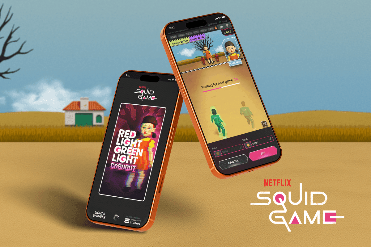
Delivered a complete licensed Squid Game experience that transformed a traditional crash game into an immersive Red Light, Green Light experience while maintaining familiar gameplay for existing players. Research findings directly influenced multiple design decisions, including the betting layout, information hierarchy and gameplay presentation.


PROBLEM STATEMENT
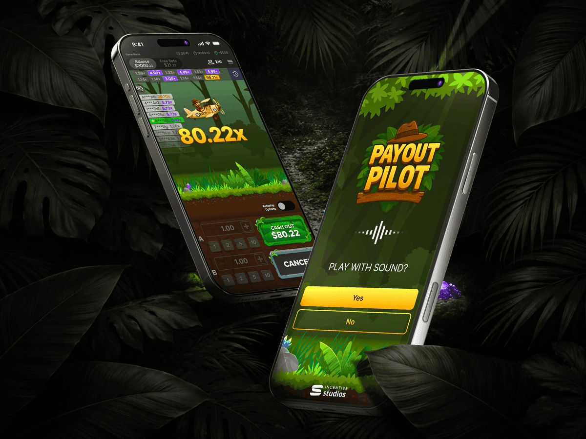
Crash games are played in short, high-pressure rounds where the game itself is the main attraction. On mobile, however, traditional layouts dedicate almost half of the screen to stacked betting controls, leaving little room for the action.
For Red Light, Green Light Cash Out, the challenge was to preserve two simultaneous bets while creating enough space for Netflix’s characters, animation and artwork to become the focus.
Traditional Stacked controls limit the game view
Traditional crash games often stack Bet A and Bet B vertically. This works for a simple plane game, but it takes up valuable screen space and pushes the action into a smaller area, especially on smaller phones.

USER RESEARCH
Research showed that players in different markets expected very different experiences. Players in Africa valued familiarity and simplicity, while players in Michigan expected a more polished, entertainment-led experience with sound, animation and stronger visual feedback. These findings influenced how much emphasis we placed on the gameplay itself rather than the betting interface.
FEEDBACK FROM PLAYERS IN AFRICA
Keep it simple. I already know how this works from Aviator.
African user 1
I look at the graph (History) before I decide when to bet.
African user 2
Trick is to have 2 bets. 1 at 80ZAR and 1 at 40ZAR. Set bet 1 to auto cash out at 2x, and let the other bet ride as long as possible so you do not lose your money
African user 3
If the game is not hot, I will not play and come back later
African user 3
FEEDBACK FROM PLAYERS IN MICHIGAN
Where’s the excitement? It feels a bit boring.
American user 1
I get the idea, but it doesn’t feel very entertaining.
American user 2
The game area is very small, and it needs more sound or animation when something happens.
American user 3
The quick bet buttons are not very easy to use
American user 4
I feel like I can beat this if I time it right.
American user 5
It’s simple to understand, but it could feel more exciting.
American user 6
The game looks so small on mobile
American user 7
Once the round starts, I care more about watching what happens than changing the bet.
American user 8
New side by side design
Rather than stacking Bet A and Bet B, I positioned them horizontally. This reduced the vertical footprint of the betting interface, increased the visible game area, improved thumb reach for two-handed play, and allowed both characters to remain visible throughout the round. It was easier to see which bet related to which player because the player sits directly above each betting option.

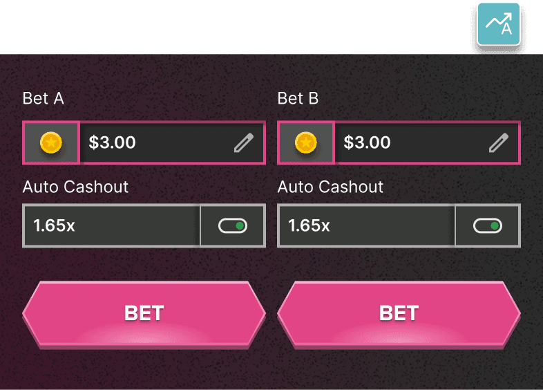
New Side by Side View
For Red Light, Green Light, Cashout, the betting panel needed to support two visible characters and faster cash out decisions. Moving Bet A and Bet B side by side created more room for the game scene and made the controls easier to reach with both thumbs.