Helping make money saving opportunities easier to notice
USER INTERFACE
UX CONCEPT DESIGN
UX IDEATION
PROTOTYPING

Current flow: hidden behind 8 steps
Money saving support currently sits away from the home screen, inside My Rewards and partner journeys. To reach it, customers need to leave everyday banking, search through products, scroll through offers and then leave the TSB app to take action.
Useful support exists, but it is hidden at the point customers are most likely to need it.
PROBLEM STATEMENT
The current My Rewards experience gives access to useful partner services, but the support is separate from everyday banking and often takes customers out of the app.
By using transaction patterns, this TSB concept could make a more informed guess about the services a customer already pays for and surface relevant opportunities directly on the home screen.


INNOVATION
TSB’s service quality scores suggest there is room to make the mobile experience feel more useful and proactive. By bringing personalised Money Checkup insights onto the home screen, the app could help customers find savings opportunities, reduce wasted spending and build stronger saving habits.
Home screen Money Checkup
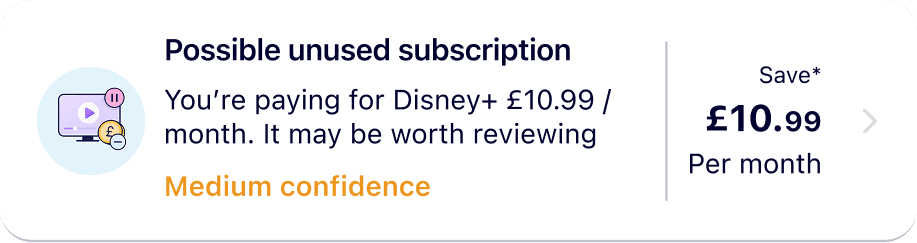
Personalised saving insights are surfaced directly where customers already check their balance. Instead of hiding support inside My Rewards, the home screen highlights relevant opportunities based on spending patterns, making them easier to notice, understand and act on.
Confirm leaving TSB app
Before sending customers to an external provider, TSB confirms what is happening and why. This makes the handoff feel deliberate, reduces confusion, and helps customers understand they may need to log back in when they return.
Confirm cancellation
TSB cannot confirm what happened on the external provider site, so the app asks the customer when they return. This keeps Money Checkup accurate and lets the customer decide whether to turn the saving into a monthly habit.
Choose an existing pot
Customers can add the monthly saving to one of their current savings pots, keeping the action quick and familiar. They can choose a goal they already care about, or create a new pot if the saving needs its own purpose.
Ready for the next saving
Reviewed insights are removed from Money Checkup, so the home screen stays focused on what the customer can look at next.
Review recommendation
The detail page shows why the insight appeared before asking the customer to do anything. It gives simple evidence, such as payment frequency and related services, so the customer can decide whether the subscription is still worth keeping.
Complete cancellation externally
The cancellation happens on the provider’s website, but the journey remains connected because TSB brings the customer back to confirm the outcome.
Turn savings into a habit
Once a customer frees up money, TSB can help them decide where it should go next. They can add it to an existing savings account, set up a Regular Saver, move it into a Savings Pot, explore Cash ISA options, or choose not to save it right now.
Review monthly transfer
The final step shows the source account, destination pot, monthly amount and start date before the customer confirms.
What this feels like in the app
The journey is technically available, but it feels separate from the customer’s day-to-day banking. Savings support appears as partner offers inside My Rewards, with the final action happening outside TSB.